Can you spot the difference?
The other day I was reading Jennifer Weiner's blog and she mentioned how alike these two above book covers are, which is one of my favourite games. It's sort of like Go Fish with book covers, so let's play...
I loved both books. I'm sure you know what In her Shoes is all about. If you haven't read Six Weeks to Toxic, I highly recommend it, and not just because author Louisa McCormack is Canadian and my publisher-mate, but because the book is actually original and witty and fun, and you know the ending before you start, which makes it one of those stories that's all about the story in itself, not as a means to an end. Louisa's second book comes out in Fall 08, and is called The Catch. Set in PEI, she's dubbing it Anne of Green Gables with sex. Love it.

I haven't read The Opposable Mind (though I love the title and cover) but I'm pretty sure there's not a huge crossover readership.
Then, of course, there is the YA headless teen cover phenomena...


I could go on, but I think you get the idea. I'm not sure why there are so many headless teens on YA covers. Bad hair days? Zits? Or is it that readers can relate better if they imagine the heroine as themselves?


I could go on, but I think you get the idea. I'm not sure why there are so many headless teens on YA covers. Bad hair days? Zits? Or is it that readers can relate better if they imagine the heroine as themselves?
When my publisher was designing the cover for Stuck in Downward Dog, one of the options was a headless girl. We nixed it because we felt the book would end up looking like YA and we didn't want readers to be confused.
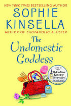
Still, are similar covers a good thing or a bad thing? Do two (or more) similar covers create a sense of familiarity so that a reader picks the book up, feeling like she keeps seeing it everywhere? In advertising, there's a theory that the more someone sees the same ad over and over, the more she begins to like it. So if the same theory can be applied to books, are the similar covers helping each other to get noticed and purchased? Or, is the not-as-well-known cover playing off the more well-known cover? That's what I wonder whenever I see this book...

Which, at first glance from outside the bookstore, I always think is mine, mostly because the cover colour is almost identical, and then get really excited that there's a whole stack of them on the table when you walk in the door. Until I realize it is not my book, and that there is the potential that someone will pick up my book, thinking it's Sophie's bestseller, only to be very disappointed. Which would really suck. It would be much better if someone thought she was picking up a boring-ass business book that her boss recommended she read, only to realize she'd bought my book by mistake, and then was so pleasantly surprised and ended up loving it.
Unfortunately, I don't know many boring-ass business book covers that have an illustrated girl with a handbag full of pretty products spilling out of it. Too bad.


1 comment:
One of my friends is an actress, and she told me that they use headless models on book covers so they can pay them less. I'm not sure if that's the motivation behind it, but apparently you do get paid less if your face isn't in the shot.
Interesting.
I never noticed the similarities in your covers - but I own both books.
By the way, there was a stack of your books in my Chapters on one of the tables.
It was awhile ago though.
Post a Comment